Everyday Usability

Saturday, June 03, 2006

telephone menu ABN

A signature is apparently not regarded as safe enough to do creditcard payments. Instead in many countries the creditcard has to be verified with a pincode. As I have never used my pincode for my creditcard before, I forget what it is. Because there are so many people like me, my bank decided to send a letter to remind us how to receive a new pincode. For that I had to dial an 0900 number and go through several menu choices. To go through the menu I not only needed my 16-digits long creditcard number, but also an access-code. Apparently, the bank always suggests new creditcard holders to give their mothers birth date as the access code and I gathered that that must be the way I set my accescode too. However, after three successive trials, in which I tried three different combinations of 4 digits to write my mothers birth date I didn't succeed. Fortunately, at that point a human operator took over the conversation from the computer. She also asked me for the accesscode, to which I replied that I must have forgotten it. She urged me to state day, month and year of my mothers birthdate, and sure enough it was the right code. Only then I realised the mistake I had made. I had falsely assumed that the accesscode is a 4 digit code. However, it is longer. Unfortunately I still don't know how long it should be (dd-mm-yy, or dd-mm-yyyy), but at least I can give it another try the next time I call the creditcard service number.

There is a way in which the bank could have made this all much easier for me. And that is simply to state, in the menu, how long they expect the access code to be. It is done in many other telephone menus I have come across, and I wonder why they didn't in this one. It would have saved both me and them some time and trouble.
Monday, May 22, 2006

Can it be THAT difficult?


During lunch time we go to the so-called FoodCourt. It is the main cafeteria on the campus where on entrance, you get yourself a tray, maybe a plate if you need one, some cutlery and perhaps a bowl to put soup in. During lunch, all of this gets dirty, but the very bright people of the cafeteria have thought of this: They bought themselves a dishwasher! So when lunch time is over, everybody has to put their tray with dirty stuff on a moving belt so it will get transported to the dishwasher which is of course situated 'behind the screens'. So far so good....

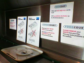
So, imagine lunch is over and everybody goes with the flow of moving people with trays towards the exit of the cafeteria (luckily they did put the moving belt near the exit). You run into the signs displayed in the picture on the left. Because of my crappy telephone picture, I will summarize here what these signs say (note the capitals...):
  • PLEASE REMOVE your WASTE from your tray. This may cause problems in the machine
Okey, that one's logical. The dustbins are quite near, so easy to find. Too bad that they are most of the time full when lunchtime is coming to an end, so I would say that it would be much proper to leave everything on the dirty tray, so dishes AND waste will get transported out of sight of customers. Not leaving such a mess around the full dustbins.
  • Please put ONLY WHITE TRAYS in the machine
Hmm.. weird, there ARE only white trays in the whole cafeteria. And does this mean that I should put my tray into the actual dishwasher or is it good enough to put it on the moving belt?

  • Please put ONLY SINGLE TRAYS on the band
What band? And what music do they play? And what happens if I do stack multiple trays on the belt? Will the system crash? Will I get an undo button? No feedforward whatsoever...

Then we see two (identical!) signs with clear and detailed instructions on how you should arrange your cutlery around your plate on the tray, because a large red cross indicates that cutlery on a plate or in a bowl is just true horror! So knife on the right, fork on the left, spoon above your plate! BEWARE!!!!
At the far left end of the sign parade there is another sign which I cannot read anymore from the photo, but frankly, I doubt if anyone reads the signs at all. Come on, dish washing surely can't be THAT difficult can it????

Tuesday, May 09, 2006

Cheap-ass programs


This is software for watching TV, developed in China. Ok, ok, it was cheap. I was already happy that I managed to install it. All I had to go by were the pictures in the manual, because everything else was in Chinese. But now that I have installed it, it can't find any of the channels on the cable. So since I got frustrated I began noticing everything that was wrong with the software. Like the icons on the windowbar that are totally incongruent with the windows standard, and that do not even have internal consistency.

Wednesday, May 03, 2006

Privacy: on or off?


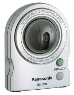
Yesterday we came across a shop register desk that was protected by a security camera. It was a Panasonic BL C10, like the one in the picture, and what struck us most was the button labeled 'privacy'. The TrustedReviews website explains how this works: A useful feature is a privacy button underneath the lens mounting as pressing this will cause the lens to retreat inside its mounting and the video feed to be switched off.

Then I wondered if the green LED on the button is on when the privacy is 'on' or when the privacy is 'off' but the camera is 'on'. This seems to be a potential usability issue, that I might want to test on some people. However, what's the use of the security camera if the 'misbehaving' can switch the camera off? Well, they thought of a solution for this: It’s a handy feature for turning surveillance off and on as required but it can be disabled remotely.

Tuesday, April 18, 2006

F-shape pattern in website reading

According to the lastest news on Jacob Nielsen's alertbox, we 'read' websites in what he calls an F-shape. 232 users (yeah that's A WHOLE LOT!) were used in his research using a gaze tracker. In the images below you see three pages that are used in the study, first an 'about us' section of a corporate website, second a product page of an e-commerce website and finally a search engine result.


So, usability-wise Nielsen again stresses out that we should follow his guidelines concerning website design and just let go of the guidelines that have always been used in print. These days' users just don't read anymore :D

And of course something to think about: Although above research seems to be clear in investigating where people are looking on a website, is it also clear in what people remember of your site? I am sure that moving images or fancy rollover menus get attention (and appear in bright red dots in the above image), but are they also registered in the users' mind?

Wednesday, April 12, 2006

Knee operated tap


Look what a lunch talk can come up with. The entertaining value of the verbal account (and stunning mimicry) of an encounter with one of these (thanks A.), was an inspiration to find some visuals. Wouldn't everybody who has never seen this before frantically look for knobs, infrared sensors or anything to touch... above knee level!?

Saturday, April 08, 2006

Never hope to find the quick installation guide quickly


When I tried to install a VoIP telephone from Philips I visited their website, as the instructions in the box told me to, to search the most up to date installation manual. My search was very rewarding... not only did I find the installation guide, I found the search to be a good contribution to this weblog. Why? The search took me through three menus and came up with three different names for what I was looking for.

The search went something like this: now where do I find the installation guide... o look a FAQ on how to install the VoIP, right on the main page, this is easy... o, the answer to the FAQ is a link to the main site, isn't it where I just came from?!... well, I'll try the menu on the left.. let's see, Getting Started, that sounds right... o they have a quick start guide, I suppose that is the same as the quick installation guide, so I'll give it a go... ah, it is a pdf file, but it's titled installation guide... are they acknowledging that there is nothing 'quick' about it already?!